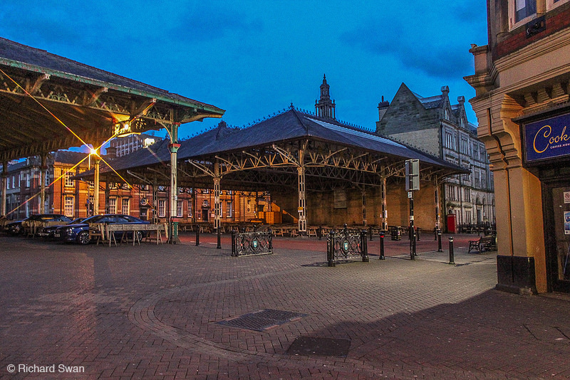
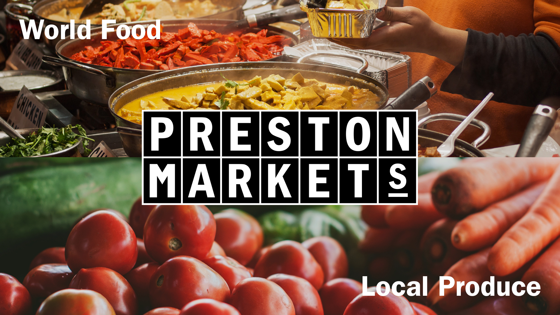
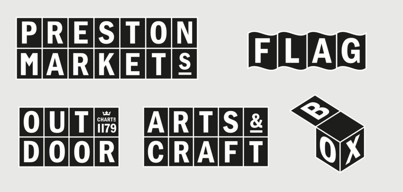
Reason for Being
Preston Markets

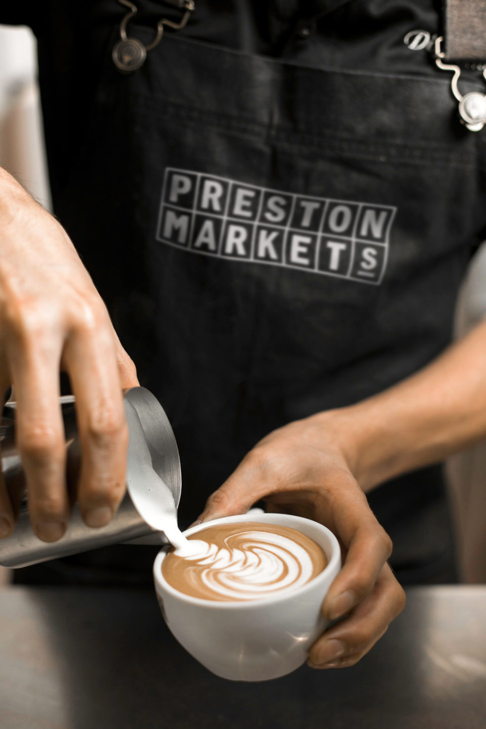
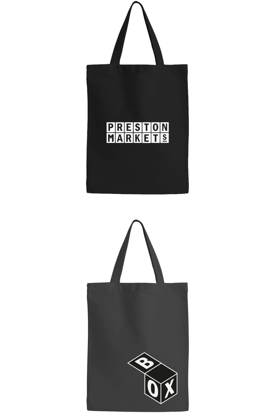
The choice of typeface on which to base a logotype is obviously critical. In this case a robust sans serif reversed out of solid blocks that represents individual market stalls would seem enough reasoning to justify its choice. Especially as it would be strong enough to standout on colourful photographic backgrounds. But…

…when The Chase talks about a ‘reason for being’ it often means going further and, in this case, a lot further. So whilst the choice of Franklin Gothic may satisfy most of the above criteria aren’t sans serifs considered to be modern typefaces? In actual fact Franklin was designed in 1902, halfway between the years the market’s two Victorian canopies were built (1875 and 1925).

It may also seem a little odd selecting an American face, named after Benjamin Franklin one of the Founding Fathers but perhaps less known for his publishing and printing interests.

Even more surprising, Franklin spent a short time living in Preston on one of his visits to England. Not just in Preston, but 100 yards down Orchard Street that runs directly from the market! It’s amazing what a bit of research turns up.

Share